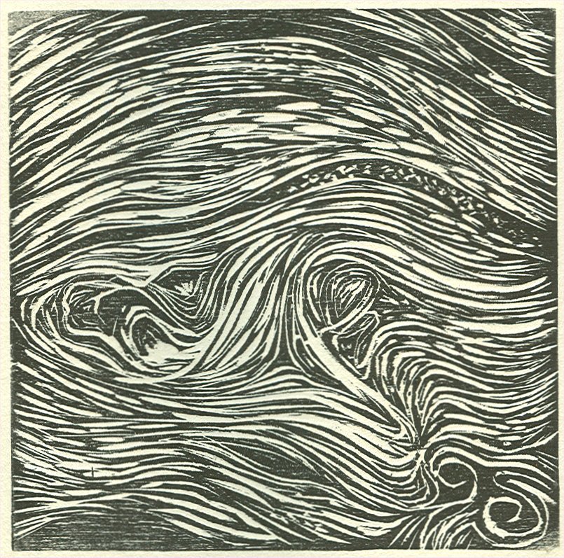
This is the gnarled block with chine colle and a leaf. The leaf worked as a stencil and blanked out the ink. But it also left an interesting leafy pattern of veins. I like this look and may do some more with leaves.
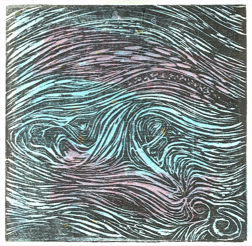
Gnarled printed on Somerset grey with chine colle. I overlapped a red and aqua Japanese tissue with flecks of silver and gold. Where they crossed they made a lavendar. I used methyl celulose paste in the lab. It acted just like rice paste I've used at home. Difficult to lay flat, but not a problem to brush flat with the brush. Easy to overlay. Would like to play with different colors, maybe tissue paper.
Gnarled is a close-up of a gnarled tree, but it can be anything -- waves, clouds, motion. This is black on grey Somerset. Black on white is good too, but I like this. I'll play with some watercolor on some of the b&w ones to see what I get.
Letting Go, reduction block print, won Honorable Mention at the Learning & Product Expo: Art! at the Burbank Hilton this weekend. 8-] Not only did I get a ribbon, but I got $100 gift certificate for Dick Blick! Woo-hoo. I entered 3 pieces and 2 got in -- Letting Go and Paleo-Umi. The two pieces inspired by Will. Letting Go was from a dream, and Paleo-Umi was a commission to illustrate his game character in ancestor form. I guess it's true when you invest emotion in a work it comes through. These are two emotional pieces for me. Now I'll have to tell Will Letting Go is an award-winning print. He has his print hanging by the front door. I think I'll hang ours over the fireplace. 8-]
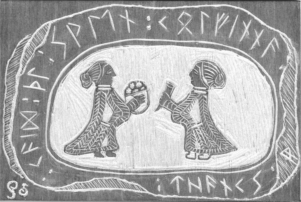
Valkyries 4"x6" Here is an actual print of the block on Somerset grey paper. I like the stone effect, as it's a runestone. The block needs some clean-up. Too many extranious lines for my taste. Kitty liked it. I can see why Vikings carved such angular runes -- it's so much easier to carve straight lines than curvy ones. I like my spiral "es" but it sure is harder carving it in wood. Perhaps I need to make a chop. The double line "P" I'm starting to use in SCA blocks is much easier represented in wood.
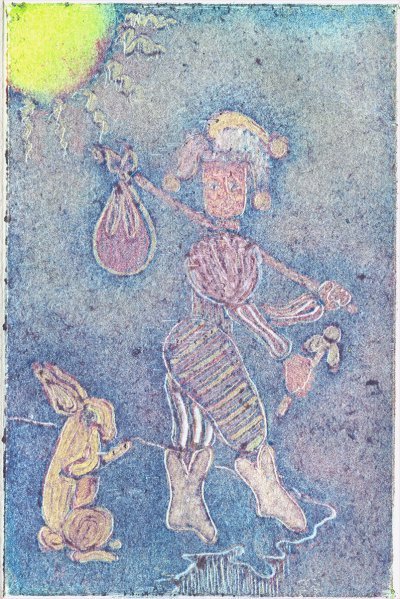
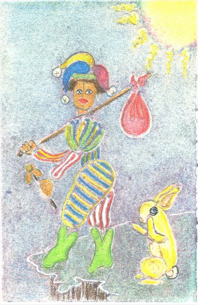
Shameless pun. ;- y This is a twist on the Fool Tarot card. The fool is usually accompanied by a small dog. Here he's traveling with a bunny...but not for much longer.
I used watercolor pencils to punch up a monotype ghost. Next I'll try ordinary watercolors.
Actually it's neither. They're both ghost prints. The plate was overinked and the first print was very dark. But there was still a lot of ink on the plate so I made several ghosts. Then, on a lark, I decided to see if the over-dark print would print, so I put it on top of the plate and printed several more. I actually ended up with an edition of 10 monotypes from one plate! That's gotta be a record.
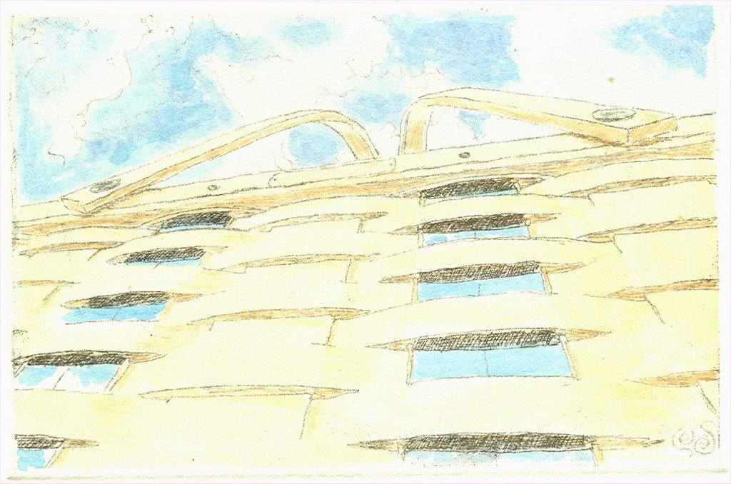
Otherwise known as the Longaberger Basket Building, corporate offices of the premium basket makers. My sister works in the basket building. It's really kewl. 8-] This is an ant's eye view.
Here's Loki just lolligagging around. His favorite position on the couch. It's also my way of making lemonade out of a particularly sour lemon. The blue was way too sticky and hard to work with so I rerolled with red and traced again. Faint blue lines came up by way of outline, and as I worked I got a kewl grape (except for a few nicely placed patches of red). So all in all a success. I liked the background when I did it, but I think I'd make it recede into the background next time. It does on the ghosts.
This is the palest ghost print -- barely an outline -- with colored pencil. Just the pimaries, red, blue and yellow. Softened and blended with a tissue. May do a little more, but I kind of like it. It was fun to do. Took me back -- waaay back -- for an afternoon. ;-> Just color, color, color.
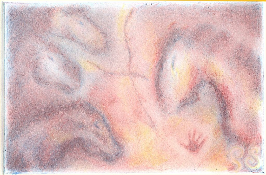
Whispers, more cave art, with an emphasis on secondary colors. Didn't manage any green, but I've got a nice maroon, purple, orange thing going on. It's hard to tell intensities with a monotype. Hence the rock weathering comes forward a little more than I intended.
I have ghosts to watercolor, with one on Arches 88 for colored pencil.
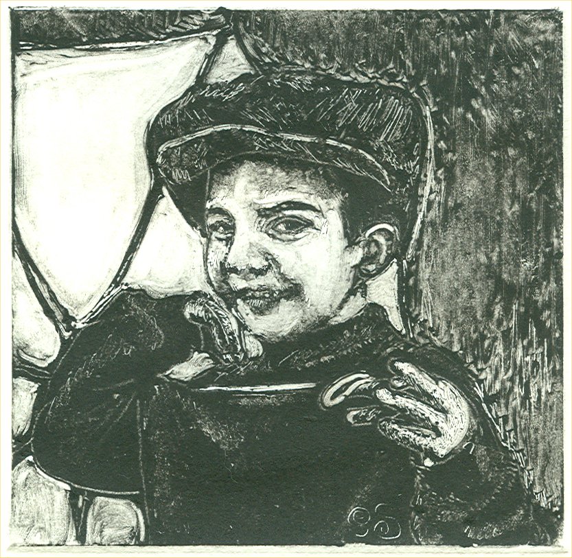
Monotype 4"x6" Billy's first Halloween. Mmmm, tasty. I think he was trying to eat the light. Monotypes are compulsive. I need to watercolor the ghost. It's overall softer with no dark lines. I'm really taken with the technique, tho you can't exactly make an edition. I want to do this image as a woodcut. I think it would be pretty interestng.
The Baren Summit was great. I never worked so hard for so long a stretch at having fun. It was exhausting. But in a good way.
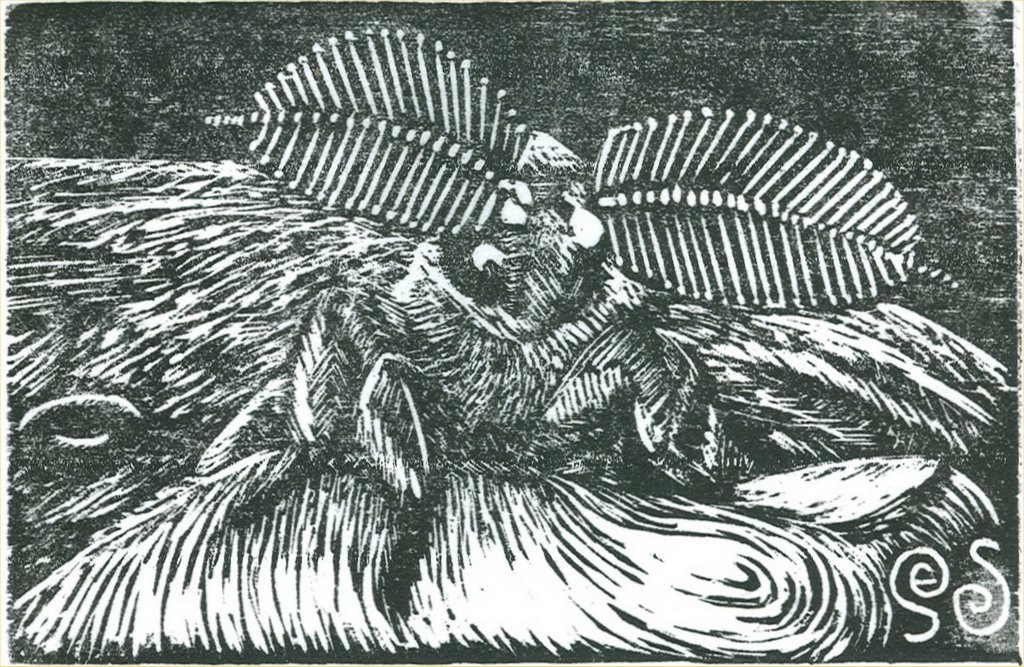
I cut this silk moth in Vancouver. It's one of Michael Cook's pets. He gets a print for letting me use it. 8-] I learned a few tricks for printing with a baren and ran off an edition on kozo paper. I'll want to try it on Somerset when I get back to class next week. And I want to get some Daniel Smith water-soluable relief ink! Such easy clean up.
Met so many great people at the Summit. This is such a good idea. Can't wait for the next one!
Working on tone and texture in my monotypes (thanx to Belinda's mentoring). 8-] As she says, it's just removing ink. Yeah, right. Like drawing is just adding ink. ;-j




 ...Are Soon Parted.