Thursday, December 18, 2008

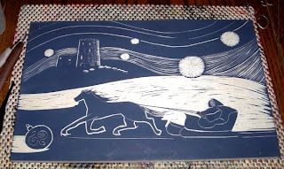
2008 Xmas Card Woodcut


Ta-da! Here it is. The 2008 xmas card. This is a scan of the card itself, which we had printed up of Vista Print. I like the blue it came out.
It's pretty much what I envisioned it to be, a wintery scene with the Schuyler House castle in the background. I call it The Horse Knows the Way.

Saturday, December 06, 2008

Horse Knows the Way -- Print


Horse Knows the Way, thalo blue w/ a dab of red.


Mirror scan of block -- faux print (curious -- comes out darker, but more or less the same woodcut marks as the print).


I'm wondering now. Would the mirror scan of the block copy better for the xmas cards than the actual print? But I do want it in blue, not black. Hmm. Also the print is a little lighter (and has the natural uneveness of a print -- well, my print anyway). ;-j

This is really new for me, so much white space on a block. I like it, but it was hard to make myself do it (not to mention using tiny tools to do it with). ;-j

Thursday, December 04, 2008

Sleigh Block -- Nearly There


The block so far


Mirror image faux print

Tuesday, December 02, 2008

Sleigh -- Scan Block


Back to work on the sleigh after the turkey day holiday. It'll be there soon, maybe this week. Tempus is fugiting.

Monday, November 24, 2008

Sleighing Away


I'm not liking the struts on the sleigh. I may remove the fore set on the far side. Have to think about it.
~*~
Thanx for the comments, guys. You convinced me. I won't touch the struts...yet. ;-> It also helped to see it in a mirror, the way it's supposed to look. So the struts stay for now. ;-j

Saturday, November 22, 2008

Sleigh Block


Going pretty fast, especially the white parts. Snowflakes are a tad tedious 'cuz the board has to be turned and it's long for that. But it's all going well.

Friday, November 21, 2008

Sleigh Block - WIP

This is a large block for a Christmas Card, I know. ;-j It's about 8"x12", but it will scale down to the size of card we're using at Vista Print. This is an online outfit we used last year to make our cards (but I had the dimensions wrong and had to cobble the image at the last minute). So this time I've made the image to fit. I hope!

I'll print up the block as well, probably for 11"x14" matting.


wip


greyscale

I don't know how the snowflakes will come out, but I like the fuzzy look of them so far. This is a first for me, putting so much white space in a block. I want to carve more lines on the snowy hill, but I'm restraining myself.


~*~


clip(clop)ing right along. ;-]


One thing you can say about all that white -- it goes fast!

Tuesday, November 18, 2008

Xmas '08


Schuyler House Xmas Card '08
a la Courier & Ives theme, with a medieval flare
started carving; also googling snow and horses and such for better subjects

Saturday, October 11, 2008

Baa-Baa Woodblock


This is a print in burnt sienna with green and purple tapped in with small stencil brushes. Practicing the technique for moku hanga. Brushes lose hairs more than good brushes would, but I'm getting a feel for brushing on color instead of rolling it on (except for the brown).


Here's a question: This is a ghost print from cleaning the block. It's more the lightness I'm looking for. So what am I doing wrong? Do I need to add more transparent medium to the inks? I haven't yet tried a paste medium. I've been using Daniel Smith water-soluable ink with some transparent medium and a few drops of water. I've been using a brayer, so it has to be tacky enough to roll. No doubt I can let it get runnier if I use a brush. Is there a happy medium or is it one or the other?

~*~


This is a faux print (mirror image scan of the block) It gives me something to shoot for.

Tuesday, September 30, 2008

Catfish Test Prints


Teally-blue made up of thalo blue, thalo green, white and base.


A failed print, but it gives me an idea for another colorway: ocre on grey.


An ocre test print.


And another one.

Saturday, September 27, 2008

Ok, I Like This One


I'll probably change something while I'm carving it, but I like this combination. Balance black and white, not too fiddly, and the head is clear.

Bill asked me last night, "How are you doing these?" ;-> Paint Shop Pro of course. ;-j. The catfish on the block is currently solid black and I'm just using the erase feature to "draw" the white areas. Just like a monoprint. ;-]


Carving away. ;-]


Looking like this.


And this. About time to see how it prints.

Thursday, September 25, 2008

Faux Print Catfish Patterns


Sylvester the catfish.


A couple of pattern ideas for my catfish.


I think that's too busy.


This one is just a little ruffly.


Too much white? I like the black head.

A darker tail and fin to match the head.

Faux Catfish


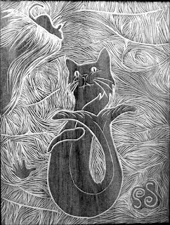
Paleo-Catfish faux print (grey scale mirror scan of block)

Now I need to google a few cat patterns and fish patterns and see how I'll trick out my catfish.

Wednesday, September 24, 2008

paleo-catfish wip


I could have stained the block a little darker, but it's coming along nicely.


It's really going quickly. Have to stop often and stretch.


Pretty much done except for the kitty. I'll work on it tomorrow.

Friday, September 19, 2008

Paleo-Catfish


I'm not sure which way it's supposed to go yet, but I'm leaning toward the top one. I drew the bottom one. I used the body from my dolphin block and a cat head. I still need to marry the two better. I like the mouse. Maybe he's a real mouse that wanders into the cave and is looking at the catfish.

Don't know the size yet either. I have 4"x6" and 6"x8" blocks. Or I could do something else. It was just time to work on a new paleo-critter.


I enlarged the body a bit. Still fiddling with it.


And a little bigger. The head is cartoonishly large. I'm trying to find a happy medium between kewt and balanced.

Monday, September 01, 2008

Baa Baa Test Print I Like


Ok, I've got a test print I like. The purple can be a tad lighter and the yellow can be cleaner, but I like the balance with the green in the corners.

Sunday, August 31, 2008

Baa-Baa Test Print


It reads purple and yellow, and it should read purple and green. I'm going to try and tone down the yellow by cutting stripes. If that doesn't work, I may cut it out entirely.

It's only a test print, and an actual print will sharper detail, but the lavender at the bottom comes off weak.


Ok, I've added stripes. I'll see if they're wide enough when I print it next.

Haven't printed it yet, but I have an idea. I'll roll up the middle in purple, top to bottom. Then I'll wipe it off the lavender leaves and the sheep. And I can roll up the sides with yellow and wipe it off the laurel leaves. Then add the greens and blacks where necessary, and add it to the corners. That way I can get a bit of background.

Alternately I can roll up @ section in its color -- black for the sheep, green for the bottom (then wipe it off the flowers and add purple). And black can be more of a charcoal.

Anyway it's something to experiment with tomorrow.

Saturday, August 30, 2008

Carving Baa-Baa Block


4"x6" shina

Carving.


greyscale w/ high contrast

Wednesday, August 20, 2008

Baa-Baa Block


the way I'll carve it:


A couple of sketches for my baa-baa device block. I'm thinking of a 4"sq. block, but I could go larger.


A color sketch.


another permutation: this one is in 4"x6" format. Also gets my scallops in, and incorporates my initials into the wool.


a little more tweaking, and in color

Dang. I keep harking back to an older version of my arms -- currently and officially, the "sky" is purpur.
baa-baa 4"x6" carving direction