skip to main |
skip to sidebar
Still More Messing
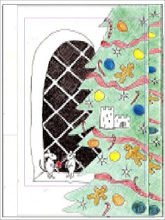
I really must stop messing with the design and start carving. I'm not sure what I think of the addition of garland around the window. I think it actually detracts. Or it might balance the color. But which?
I think I can get away with carving 2 blocks. One for the green and one for the black, with the ornaments tapped in. I'll have to see if that's practical.
carve
Working on composition balance now. This is what it'll look like on the 9"x12" block. It looks like crap because I overlay images in PageMaker. I'm only interested in the placement of image and white space here. The tree comes a little past the center of the block, but the window is a more dynamic image.
I've decided against the garland.
Huh. I've just noticed the center of the window is the center of the card.
print
Can't forget what's mirror and what's not. Keep an eye on the castle. ;- j
Card will be more like 4.25"x7.75", but I'll keep this balance.


No comments:
Post a Comment