Wednesday, October 28, 2015

Busy Art Day


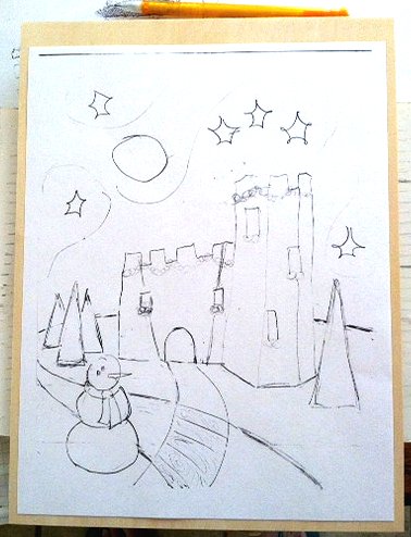
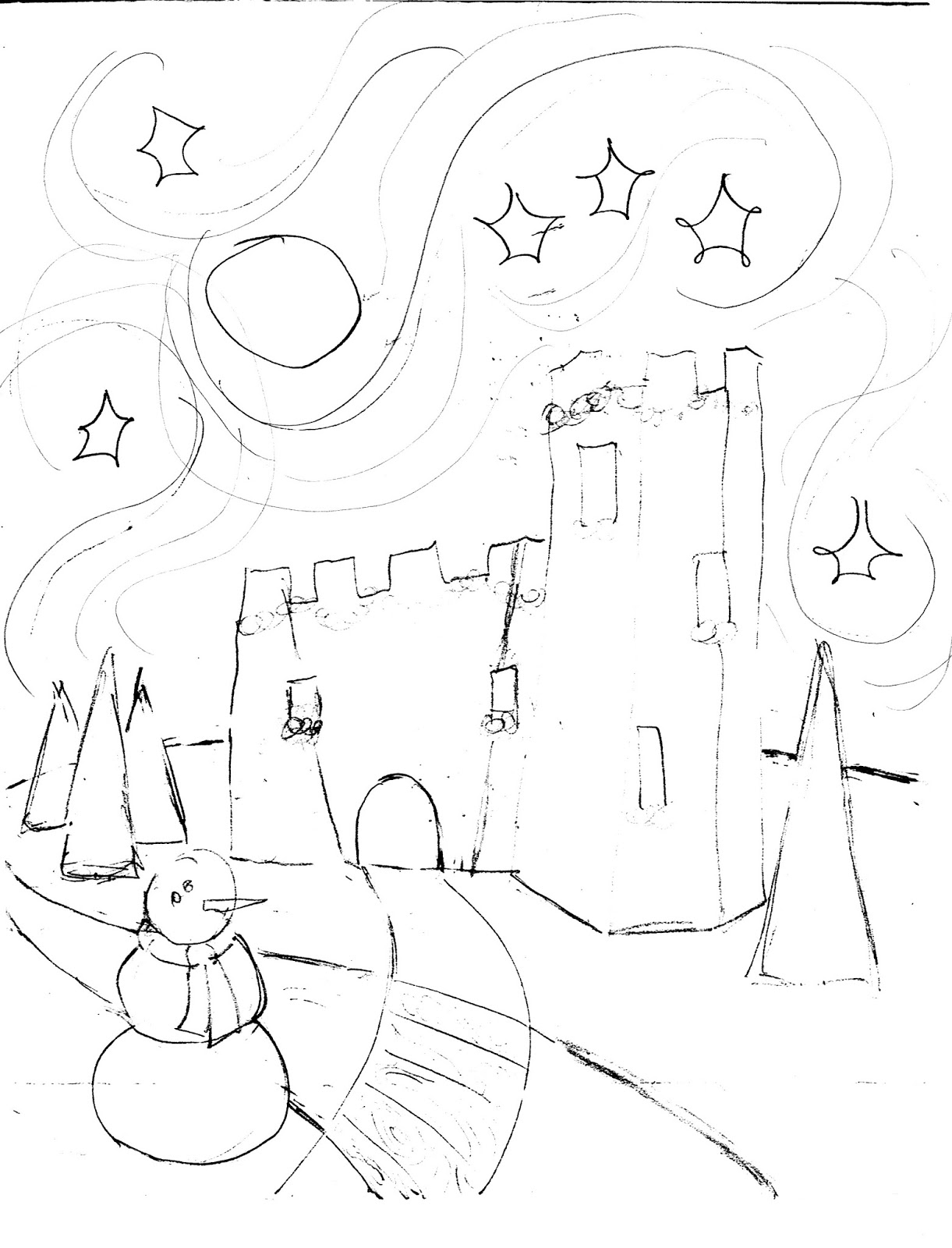
Tina sealed my pastel woodcuts with final fixative.  They look more jeweltone.  All along I was thinking they'd look muddy or dark, but I guess fixative has improved since I was in high school.  
;-}  I'll have pics later.

Pastel'd a mini-dragonfly ~ from an ATC exchange.


3-color technique (red, green, yellow-orange) with purple and a reddish brown in the background.  Also a thin line of dark blue under the body to make it more 3-D.

Worked on a new chop.


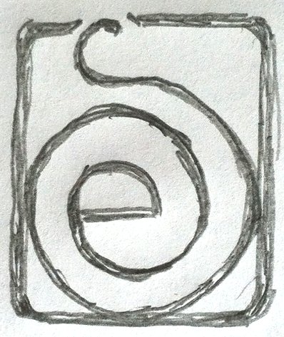
I prefer the rectangular one.  Looks more like two separate letters.


Square is ok, more chop-like.  Have to see if it reads like an e and an s. 


So what size?


Smaller?

About that I'd say.

Or this?


Wednesday, October 21, 2015

Gabby ~ Gabrielle


Gabrielle with steampunk wings.  8-]


Thursday, October 15, 2015

Steampunk Critters


Working on a new woodcut.  Nicolas (Nicky Chong).  I've decided to carve a 4"x6" block.

Still thinking about a matching one for Gabrielle (Gabby).

Saturday, August 29, 2015

Crossing the Streams


This is the cartoon I came up with once I started thinking of it as a tapestry instead of a woodcut.

Can do either, or both.  8-]


carve this

Cartoon with swirls around stars (like a tapestry).

Cartoon with star echos like a woodcut.


Wednesday, August 26, 2015

Castle Tapestry Look


Today's best efforts arting at Tina's.  Leaning toward a simple tapestry look and not a quilt anymore.

Tuesday, August 25, 2015

Saturday, August 22, 2015

Colorway that doesn't suck


Having trouble with color.  I have to go minimalist:  blues, blue-green, gold.  First colorway that I don't hate.

Saturday, August 15, 2015

Castle Colors


More fiddling with color.


I'm liking this one quite a bit.  Might be getting there.

***


More fiddling.


Wednesday, August 12, 2015

2015 Xmas Card


Doodling some ideas for the xmas card.


Going for a quilted look.  Needs a sheep I think.  ;- }

Medieval colorways:


Basically red/green/gold.


***


Also, leaning toward Craftsman colors:


Wednesday, July 01, 2015

Back to Baby Octopus


Working on colorways and carving plans.

I might start carving over the 4th long weekend.  8-]

Wednesday, June 17, 2015

Friday, June 12, 2015

Dino-Cat-Moth


I like this better.  More motion.  And they both lose out.  ;->

Adding a garden background.


Perhaps the dino-bird will be jumping up to get the moth.


Paler garden so I can see elements better.  I won't carve much of a garden ~ I'll pastel color later.


Wednesday, June 10, 2015

Early Bird & Cat Sketch


Early bird and a cat squaring off over lunch.

In the garden with grass and plantings (likely agapanthus, my favorite alien flower).  Plantings go diagonally across the back.

Maybe some greenery in the foreground or the mid-ground.

Thursday, May 14, 2015

More Pastel Play

Bookkeeper

Bookkeeper getting more detailed.  The detail I couldn't get into the etching.  Also I'm really liking the color.


Paleo-Unicorn

Paleo-Unicorn is a failed print ~ the hand was all smeary.  But adding color makes the whole ting dynamic.  Color doesn't come across bright enough, nor does the gold and silver shimmer, but it's rather nice.  Tina told me to stop, it was done.  ;-]


Wednesday, May 06, 2015

Bookkeeper with Pastel


Bookkeeper

Pastels and pan pastels on the intaglio etching Bookkeeper.  In secondary colors.  Tina had me add more darks and a redder purple in the medium shadows.  Better.

Wednesday, April 08, 2015

Early Bird ~ WIP


Early Bird woodcut with Pan Pastels.  First pass.

Thursday, April 02, 2015

Knight's Tale ~ Canterbury Tails ~ Pan Pastel

Scan.  On printmaking paper.  Nice tooth for Pan Pastels.  Not quite finished I think.

Wednesday, April 01, 2015

Toothy Paper


Toothy printmaking paper takes Pan Pastels better than sketch paper.  (Kind of a duh, but nice to know it pans out.)  Richer color on the toothy paper.


Top: printmaking paper; bottom: sketch paper.

Toothy paper is richer for taking more pastel.  Sketch paper looks more like a a book illo.  Interesting.