Friday, January 13, 2006

Winter Solstice, Chine Colle


Here's a chine colle print of my winter solstice block. Kewl process. The chine colle paper is gauzy with gold and silver flecks, which is really all that can be seen. It has a bit of texture tho. Rather odd -- not sure what it's supposed to be like. Seems a little rough. But I have a lovely embossing from having wet the paper (chine colle was applied dry). This has possibilities! 8-]

Friday, January 06, 2006

Paleo-Ho-Ho!


Paleo-Ho-Ho! 4"x6"ish

Psuedo-print -- block scanned, reversed & gray-scaled. I meant to have this finished for xmas, but I'll have it for next. I've done this theme in drypoint and reworked it, but I haven't been happy with it. I think it lends itself to woodcut better. Has more movement.

I get a kick out of my "hand print" motif done in mittens. ;-j

Winter Solstice -- Psuedo-Print


Winter Solstice psuedo-print -- that is to say, it's the block scanned in, reversed and gray-scaled. It's what a print will look like once I print it.

This is the new block I carved for the ssnw exchange. I decided to use the Freya print for the year-of-the-dog exchange print exclusively.

Monday, December 05, 2005

Printing Process -- Umi

Here is the inked block and the finished print, a three-color viscosity woodcut.


Tapping on thalo blue mixed with miracle gel to repel other colors.


Rolling on yellow, red in turn, also of different viscosities that will allow each to print.

Printing block face down on dry print paper. See slats to hold roller off print bed.
Cranking through the press with slow, even pressure. Lifting the block to reveal the print.

Monday, November 21, 2005

Not Even a Mouse


This is a woodcut, roughly 4"x6", from a blind contour of Freya on the couch.

I mixed up a light brown w/ miracle gel and tapped it onto the block. I then rolled the block in a thalo blue (w/ a tad of white). Then I tapped on some black.

This is one busy little block this Christmas. First of all it's my class exchange print (fortune cookie: appearances can be deceiving). Then it's going to by our Christmas card, at least for a dozen or so. And then I've signed up for a Solstice exchange, and that can run as much as 35! And of course it's my card for the Year of the Dog. No wonder Freya's sleeping -- she's exhausted. ;-j

Saturday, November 19, 2005

Paleo Umi Prints


These are some of the first prints of my Paleo Umi block. Thalo blue w/ white (the blue was giving my trouble, so I punched it up) was the last. The blueish-grey was the first -- the blue would not sit on top of the black. The reddish and greenish ones were attempts at viscosity prints, but as I wanted the blue to be dominant on the dragon, it wasn't working well. Had I wanted to wipe the blue instead, I could have gotten a brighter dragon I'm assuming. I'll be trying that next.

I want to make a blue dragon, red hand and somewhat mixed or neutral background. Still working out the logistics.

Thursday, November 17, 2005

Umi Block


Woodcut block for Paleo Umi, 9"x12". I'll start printing it tomorrow in lab. It's Will's Umi, but I'm also using it for my final exchange, the illustration of a fortune cookie: appearances can be deceiving. Appropriate as Umi is a shape-shifter.

I'll run this past Will to be sure, but I believe Umi is supposed to be blue with silver/white down the back. Also a blue jeweled eye. I made it faceted and it can be hand-colored.

He left it up to me, but I decided to go with the various elements of a Japanese dragon -- fur down the back, horns, whiskers. I believe he said three claws, but I went with that for esthetics.

I'm particularly proud of the gesture. I looked at a lot of dragons before I happened upon the pose I wanted. I modified it to my purposes. Also the woodblock was serendipity -- it had the circular water pattern I wanted to imply.

So this is my interpretation of a Paleo Umi.

Wednesday, November 09, 2005

All Done... 8-]


The block is done. I printed the last 4 prints today. This one was very labor intensive as you can see. All that light blue had to be blotted away before I could print the block. I suppose I could have made myself a template to mask that area, but I got pretty good at cleaning it up. Baby powder helped.

I had less to clean up once I stopped inking the whole block with a large brayer and worked with a small one on just the blue areas. But of course I was nearly done by then. ;-j

Well. My first retired wood block. I haven't quite figured out what to do with it. Put a hook on the back and hang it up? Too bad I have zero wallspace in my studio.

Tuesday, November 08, 2005

Ta-Da! Final Printing

Ok! Here's Letting Go, my reduction print. Three colors plus white: yellow-orange, alizarine crimson, thalo blue (w/ a touch of white for opacity -- I was getting more of a black than a blue from the under colors).

Inspiration for this piece stems from a dream I had this summer. This is Will's senior year at Mudd and after that he'll be going out into the wide world on his own. My dream dealt with taking a little Billy to the bathroom and losing him. He didn't come out, so I went in and he wasn't in there anymore. My dreaming self realized he was out in the wide world all alone and I'd never find my little boy again.

Talk about getting hit over the head with the clue stick. :-j So I began planning a woodcut to commemmorate the impending event. And not just any woodcut but a reduction block, so that when the print is done, the block will be also.

A cathartic experience.

There are 16 prints in all (still printing the last few), but not all of them are what I'd call good. So the final edition may be smaller. Just so long as there is one for Will and one for me. ;-]

Wednesday, November 02, 2005

More Carving -- the Last?


Ok. I believe this is the last carving session. I may have to tweak something after I test print, but it's basically ready to print the final color.

Sunday, October 30, 2005

Carving Away


Almost done with the last carving. Carved away the hands, highlighted the sleeve, carved the hinge, working on the background for the blue man, gave grain to the hinge end of the door, and am enlarging the stars.

I should be able to print the 3rd color tomorrow -- Wed. at the latest.

Saturday, October 29, 2005

2nd Printing


Color #2, alizarin crimson. I decided on stars for the "wallpaper." I've carved away the hands, etc., and am almost ready for color #3. So far so good. 8-]

Sunday, October 16, 2005

New Look

Changed the look of my blog to Scribe. Just seeing what I can do with it.

Blogs Illustrated

I'm not sure how this ended up here. It's not where I intended it to go. Oh well.

Friday, October 14, 2005

Still Carving


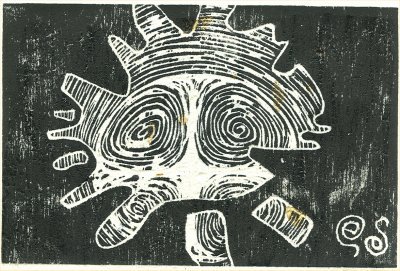
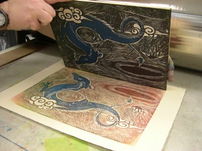
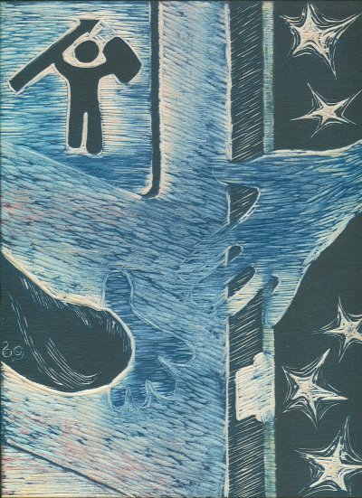
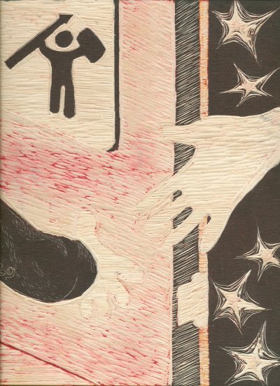
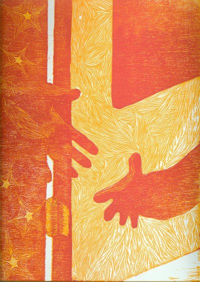
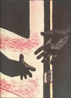
This is the 4th carving, more detail. I've been printing samples with varying success. I was trying for a transparent red, but it turned out to be way too tacky. So I'm back to straight aliz. crimson. I can eliminate the markings on the door panel by using a guide along the left side when I'm inking, and blotting away any ink that hits the block. Baby powder helps with this as well. Not a problem.

I was about to print the second color when I remembered I had to carve the first pass of the wallpaper. Then I had a crisis of design and hit the books. I was paging thru a Pre-Raphaelite book and was thinking of checking out William Morris as well, when I started noodling around with vines and stars and stuff. Much more noodling, including a session with pumpkin spice coffee at Java 'n Jazz, and I believe I have my design.

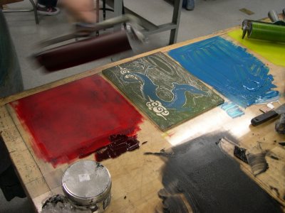
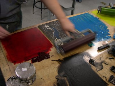
Yellow stars with red rays on a blue field. Blue may turn out more purply, have to see. But the centers of the stars will be yellow with yellow rays interposed with red ones, which will transition into blue on the final printing. (See 
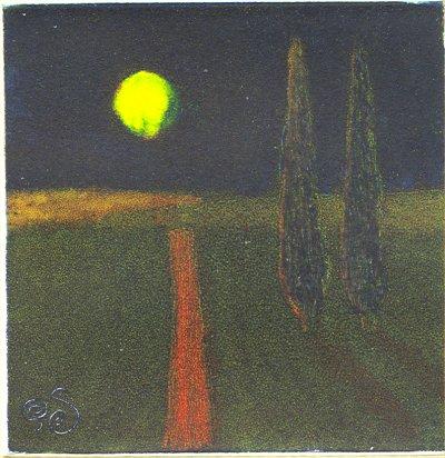
Once In a Blue Moon for an idea of the stars.)

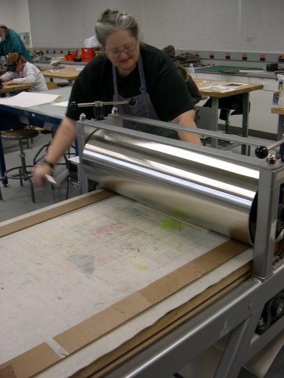
So that's where I am at the moment. 8-]

Monday, October 10, 2005

Next Carving


Carved away pattern on door, highlights on hands, hinge. I'll test print it on Wed., carve more if necessary. Then do the second printing in transparent aliz. crimson.

Friday, October 07, 2005

Under the Tuscan Moon


Viscosity monotype, 4"x4". An attempt at a Tuscany style print. On the dark side.

Monday, October 03, 2005

First Printing


I bit the bullet and printed the first color of my reduction print, a yellow/orange (process yellow, vermillion relief ink). I printed 16 1/4 sheets (11"x15") Arches cover, dry, 2/10 setting on the relief press.

Next stage: carve away the door, cut hatch lines into hands for lighter tone, carve away light areas on hinge and hatch lines for shading.

Possibly also: carve first botanical pattern into wallpaper.

Second inking will be alizarin crimson in transparent print base.

Wednesday, September 28, 2005

Second Carving


Second carving, still no print yet. I carved more space for the slanting light on the door. It ought to work. Also the white space behind and under the door.

Next step: ink it up. I'm not certain how many copies I'll make yet. A small number, but allow for spoileds.

I'm also wondering if I should make a couple shades of yellow?

Reduction Block -- 1st Carving


1st carving of Letting Go. I will also be carving out the space under the door and between the door and the wall.
1st printing will be a yellow-orange, as I see it now. That may change when I get into class today.
Just occured to me to carve the "light" on the door in the panel -- more white space at the bottom of the door in the pattern. Don't need another color, just more white space.